
01
–
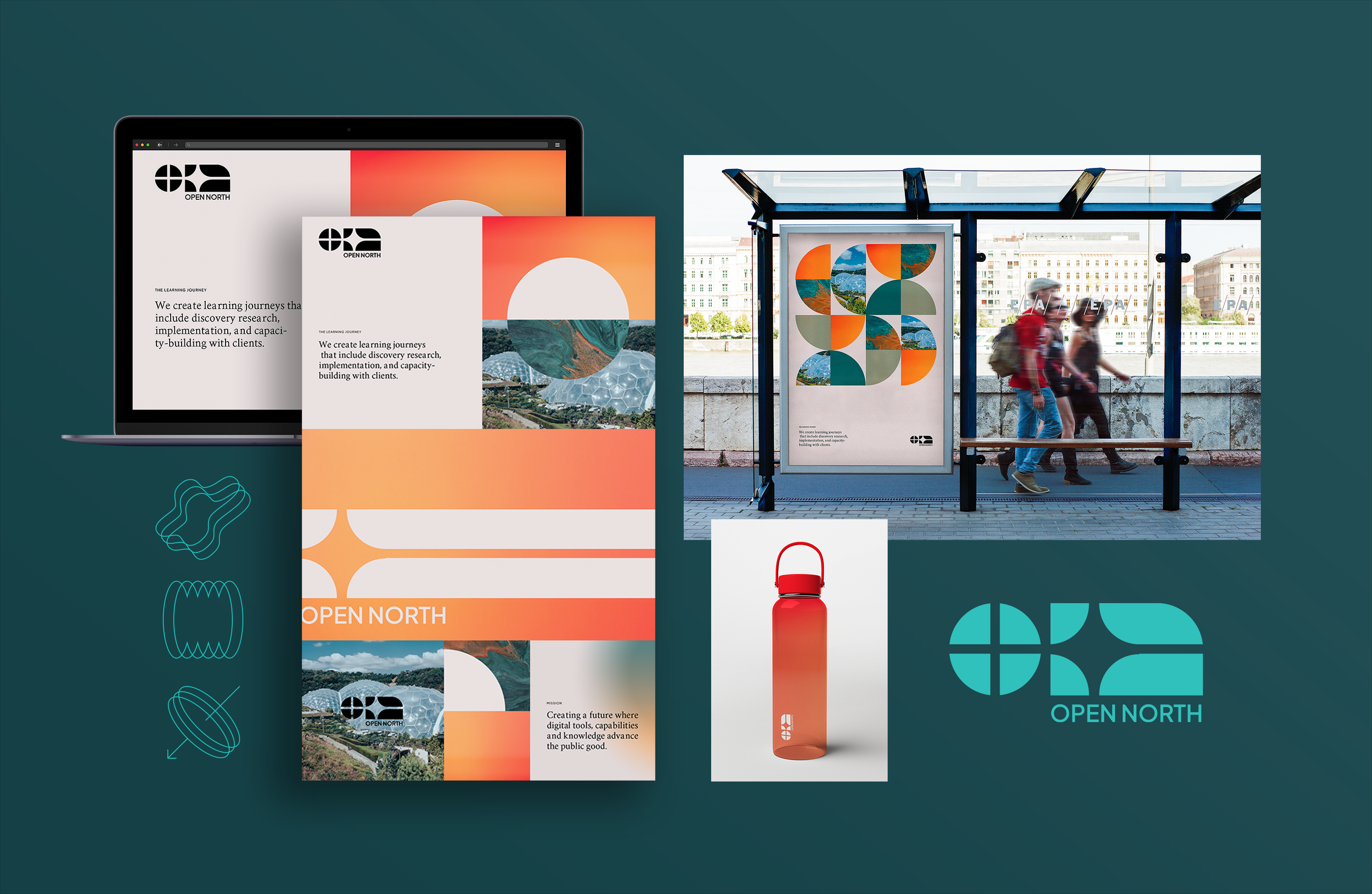
Open North brand design
Organizations can change. Cultures can change. Systems can change. Never all at once, but through a series of thoughtful steps fostering trust, building confidence, and shaping policy — setting in motion an arc of change that may not have seemed possible.
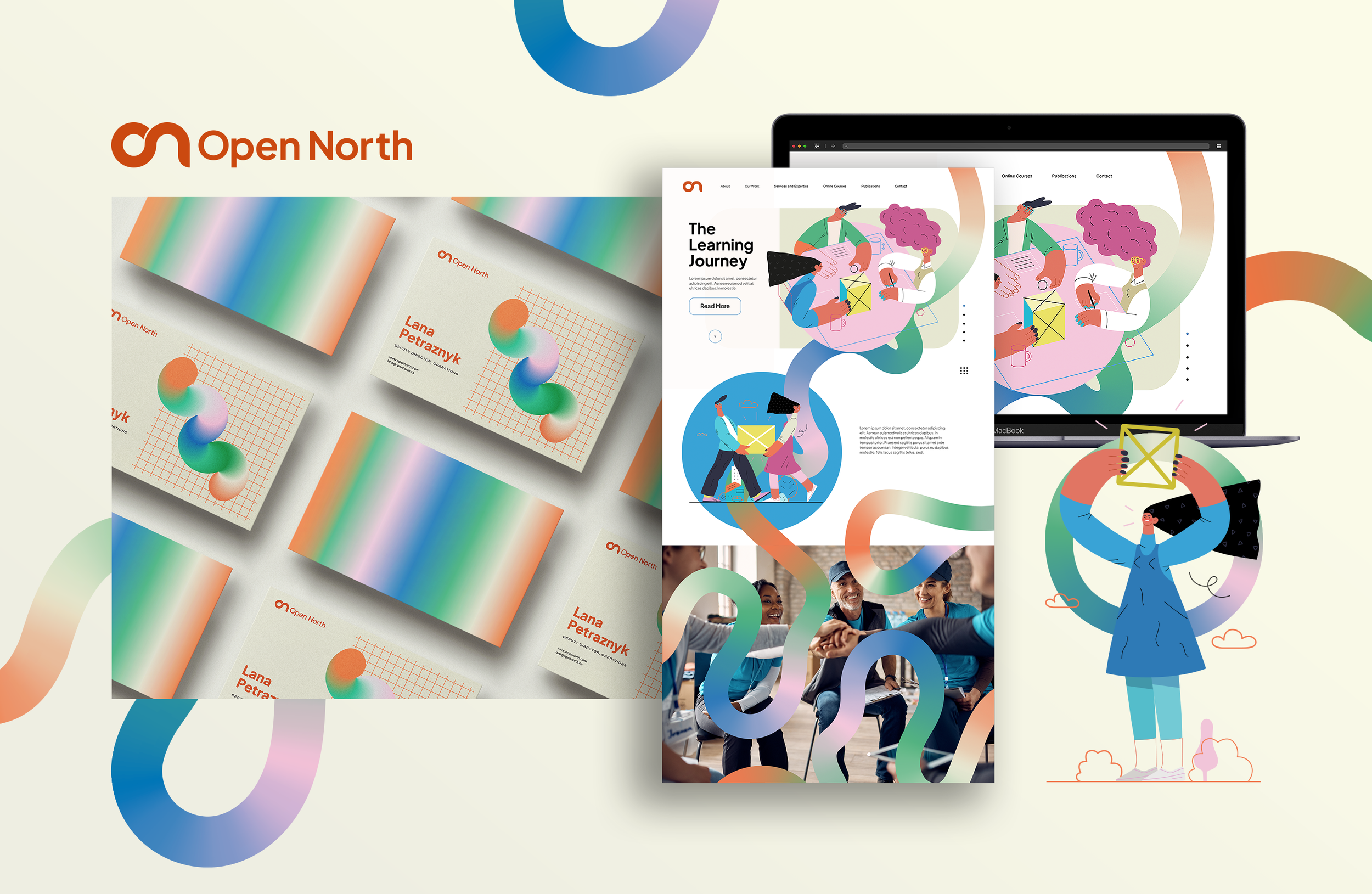
Open North works with non-profit and public sector organizations to transform their data and technology systems into tools for transparent, accountable and inclusive communities.
Working with Field States I designed a visual brand system illustrating the organization’s innovative partnerships evolving and co-evolving their client’s data ecosystems to ensure they are equitable for everyone.
o2
–
Visual exploration; 3 stories
My approach to Open North’s Identity Design began with an exploration of 3 visual stories. Each story combined the same components of the organization’s mission but prioritized a different aspect of their brand personality. Through this exercise we gained clarity on the organization’s communications style. Because sometimes you just need to see it!
Visual exploration 1: Expanding Access
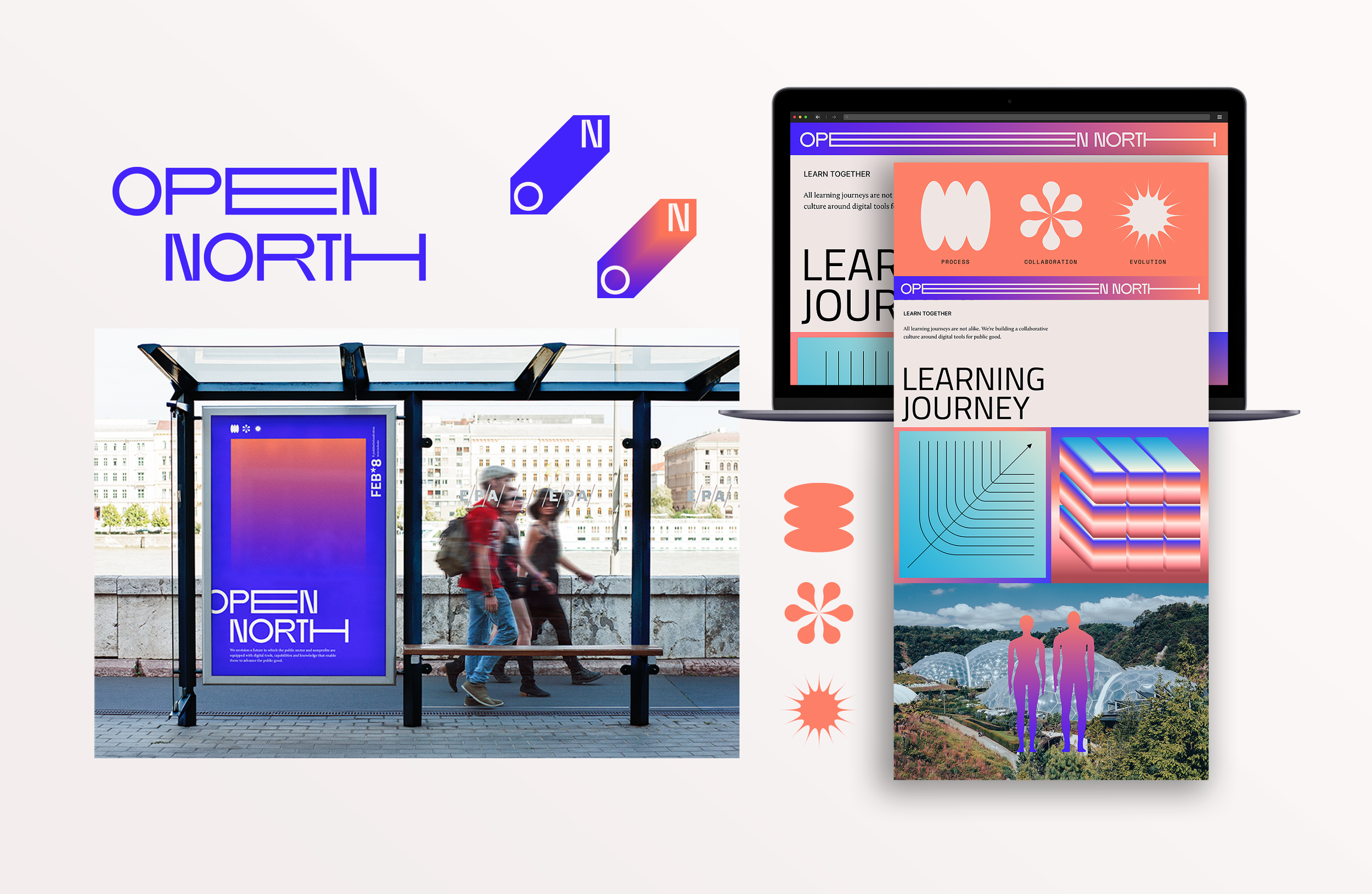
In this visual direction the organization name is stretched and condensed to communicate the ever changing and expanding nature of the policies around open data. The lines of the letter forms are pulled into the future, mimicking speed lines and illustrating momentum. Typography choices embraced a modern contrast of rounded and angular letter forms with a vibe both tech forward and friendly.
Visual exploration 2: From Point “O” To Point “N”
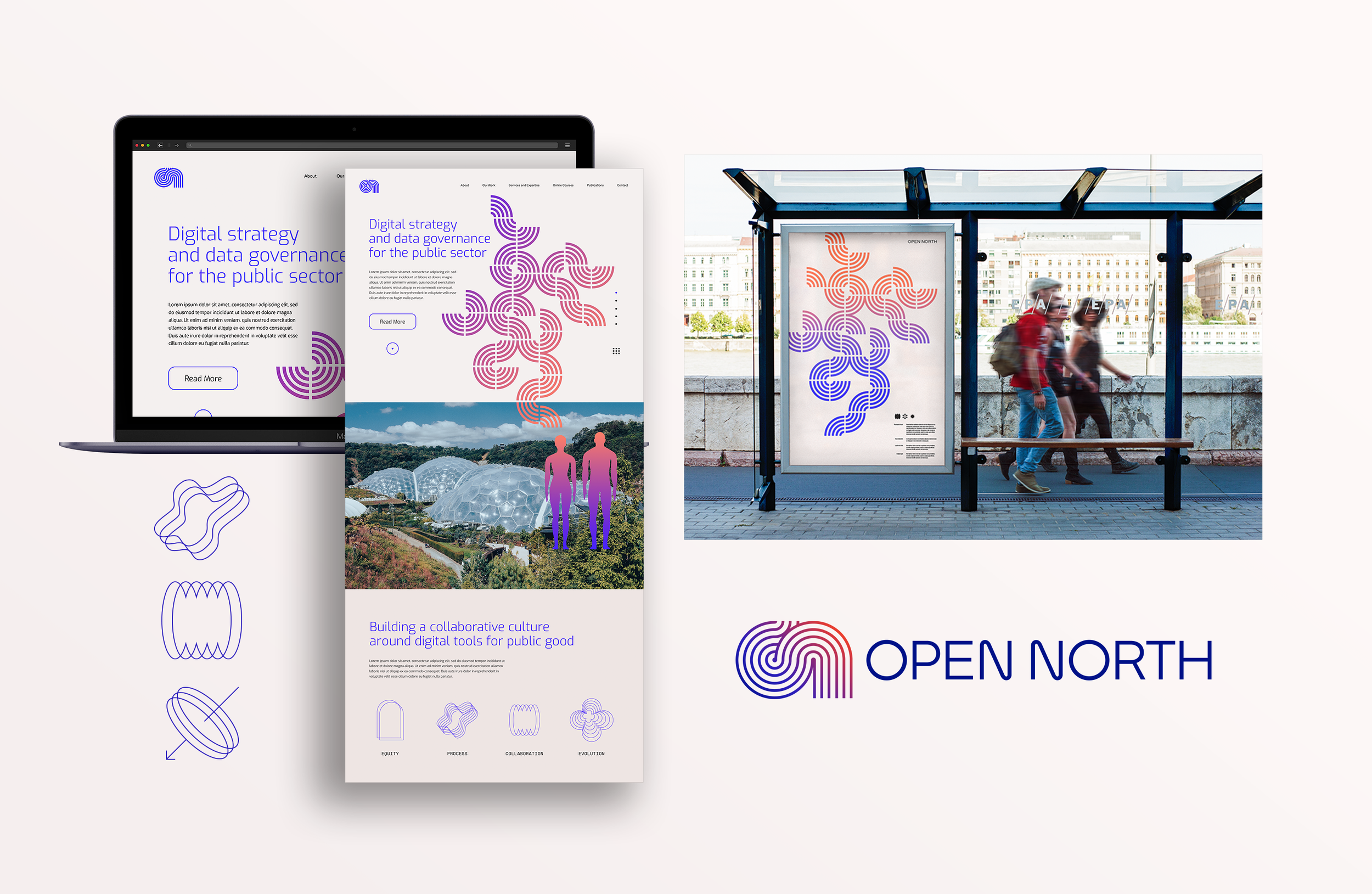
The letter forms “O” and “N” have a beautiful repetition of shapes that can easily be joined to create a pathway. By connecting these shapes we construct a visual transformation journey. As the viewer moves through the mark their eye travels from a closed structure to an open structure. In this visual exploration we look at the pathway as a visual element illustrative of growth and change in data governance practices.
Visual exploration 3: Navigation
To execute their core product offering, the Learning Journey, Open North acts as a guide for their clients who are navigating issues and potential opportunities in data governance. This visual direction continued to explore logos using the “O” and “N” shapes as a canvas for transformation. Strong directional negative space inside the marks move the eye from left to right. The pattern of shapes creates an abstract star at the center, a historic symbol of navigation.

o3
–
Translation
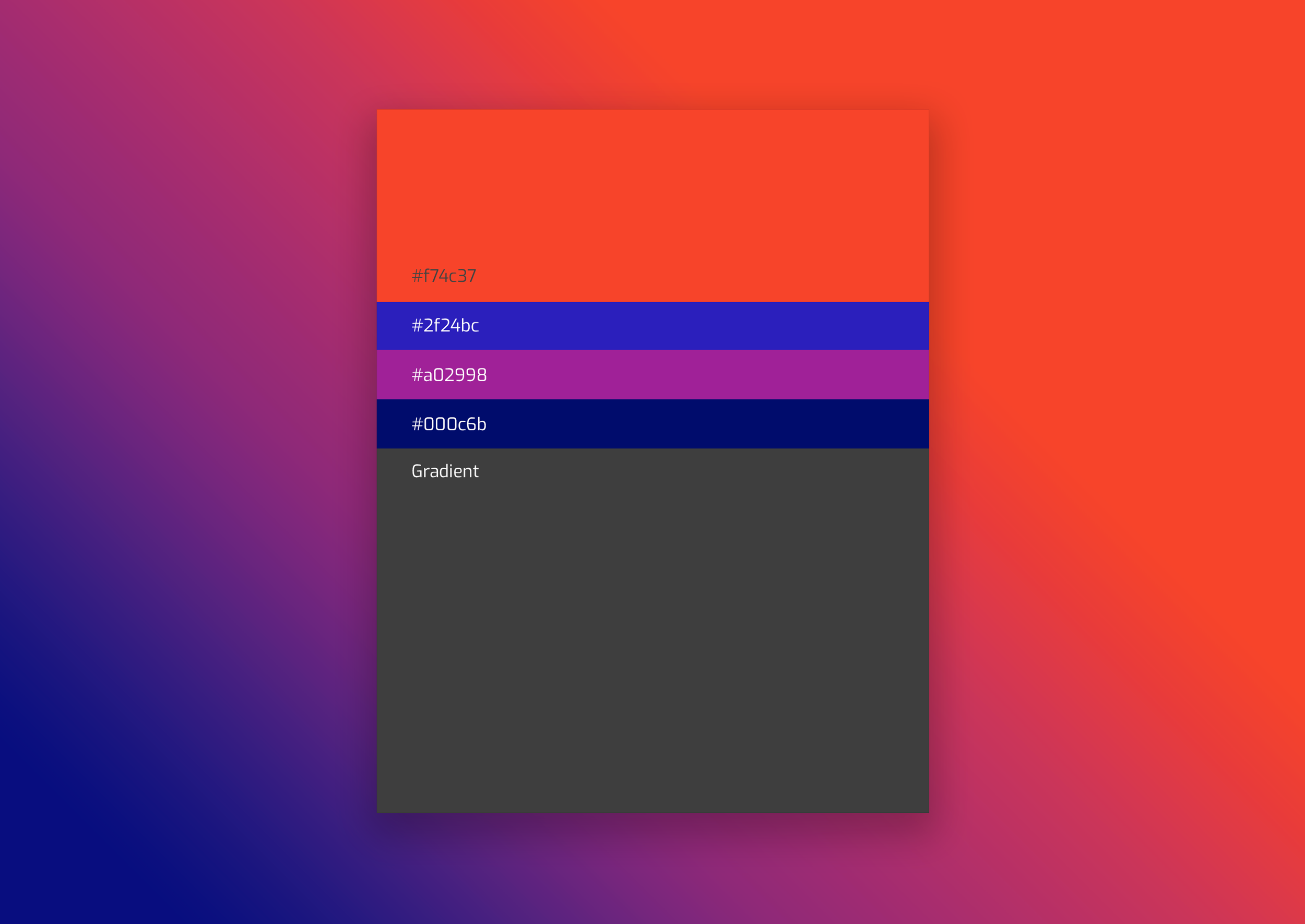
The final brand kit for Open North combined the most expressive aspects of each of the directions we explored. A bold and optimistic color scheme, unique linear icons and future facing fonts collaborate in an expression of data transformation.