01
–
Shaklee rebrand
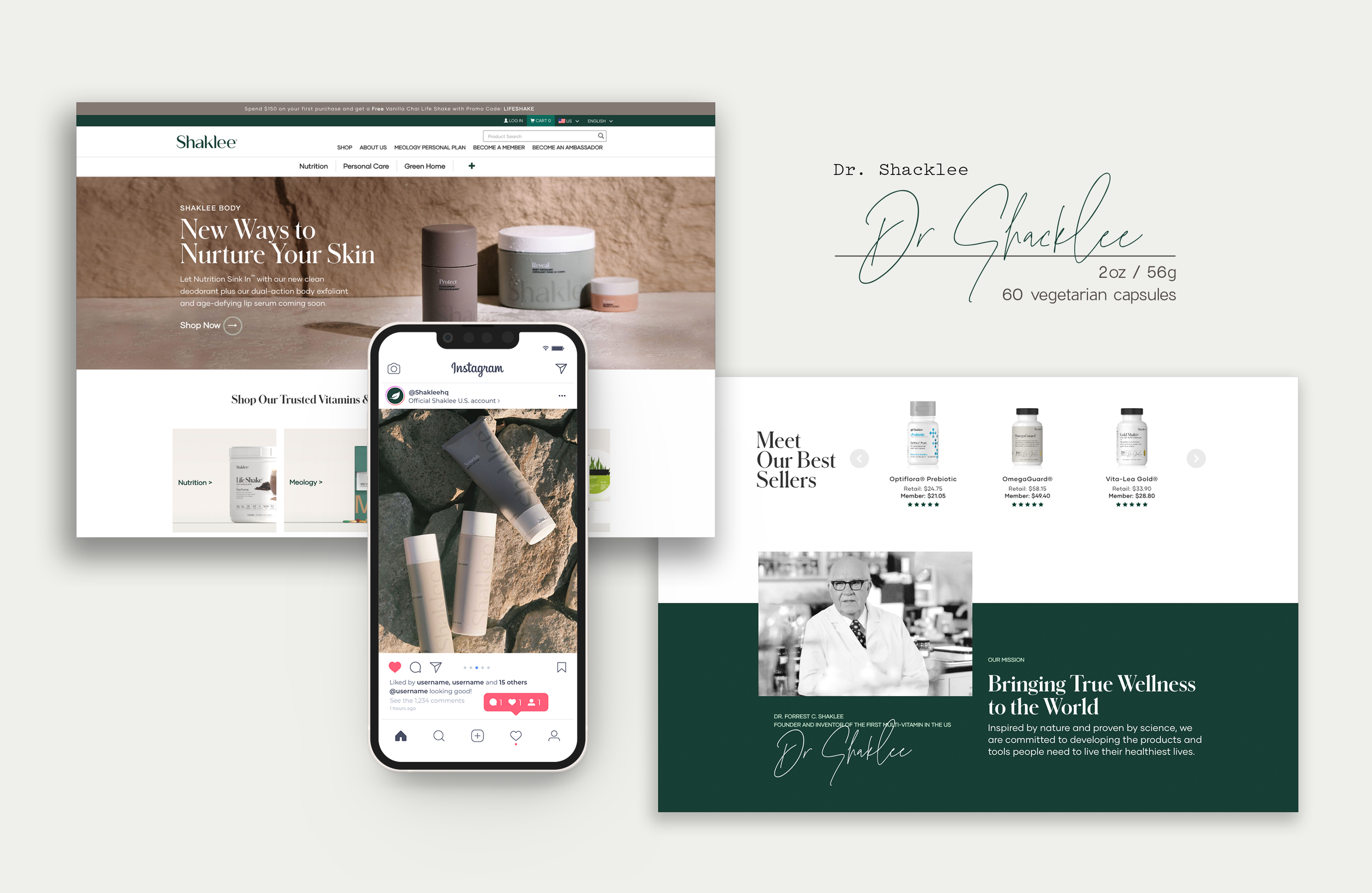
Shaklee had a great foundation, but in recent years, the self-care landscape has transformed–painting them into a dated position, look and story. Contracting for DDB, I helped transform Shaklee into a modern, relevant brand for a younger, more social savvy customer. Our goals included aging down the current customer base without alienating the older core and simplifying the messaging to make it easier to grasp what Shaklee stands for, and how their products stand apart.
Help Shaklee become “a brand known for today and tomorrow, not just yesterday.”


o2
–
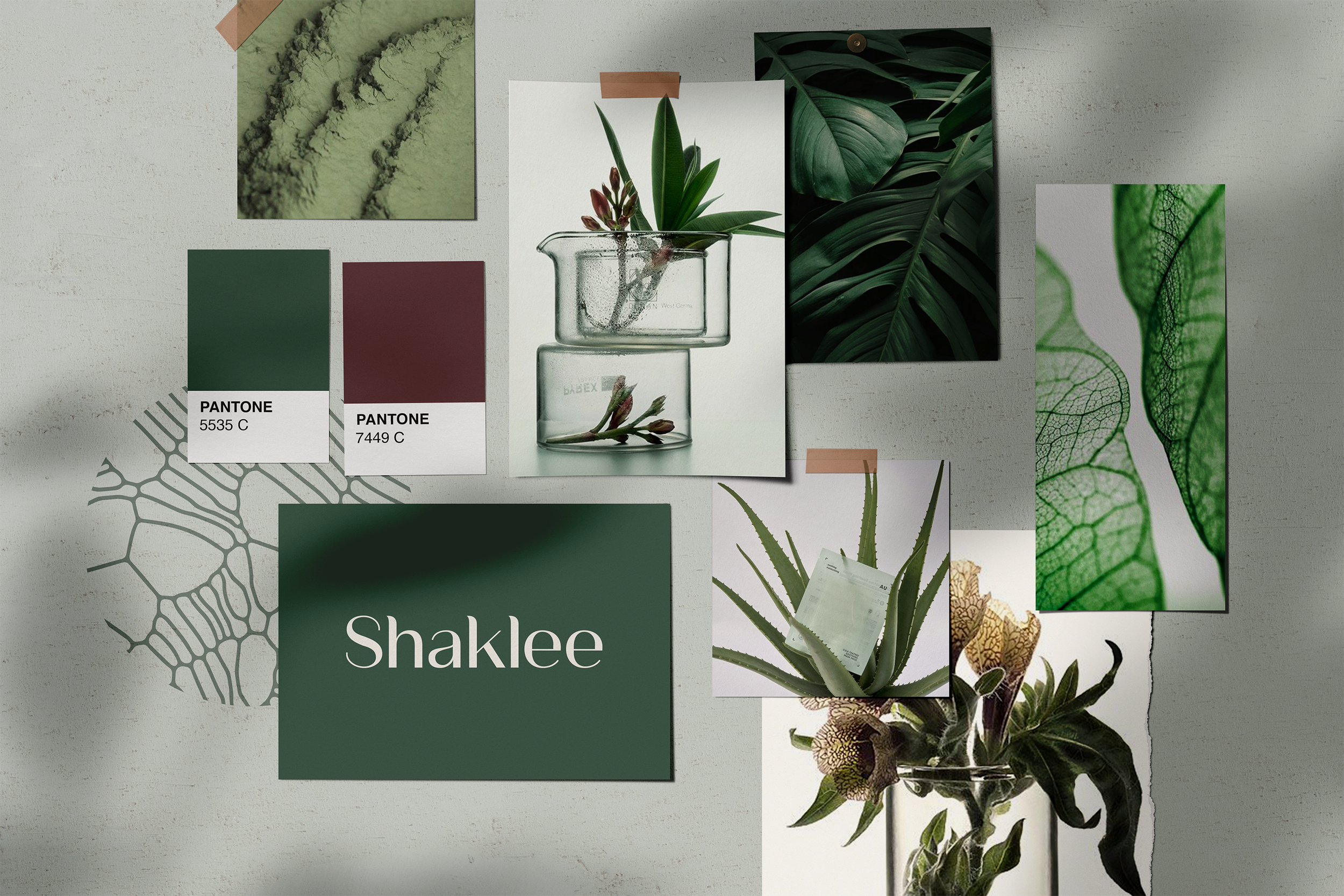
Visual exploration
We pitched and revised several directions illustrating a wide range of iterations on tone and vision. These explorations helped Shaklee discover a new voice with the right balance of ingredients to communicate the value of their products to their customer.


o3
–
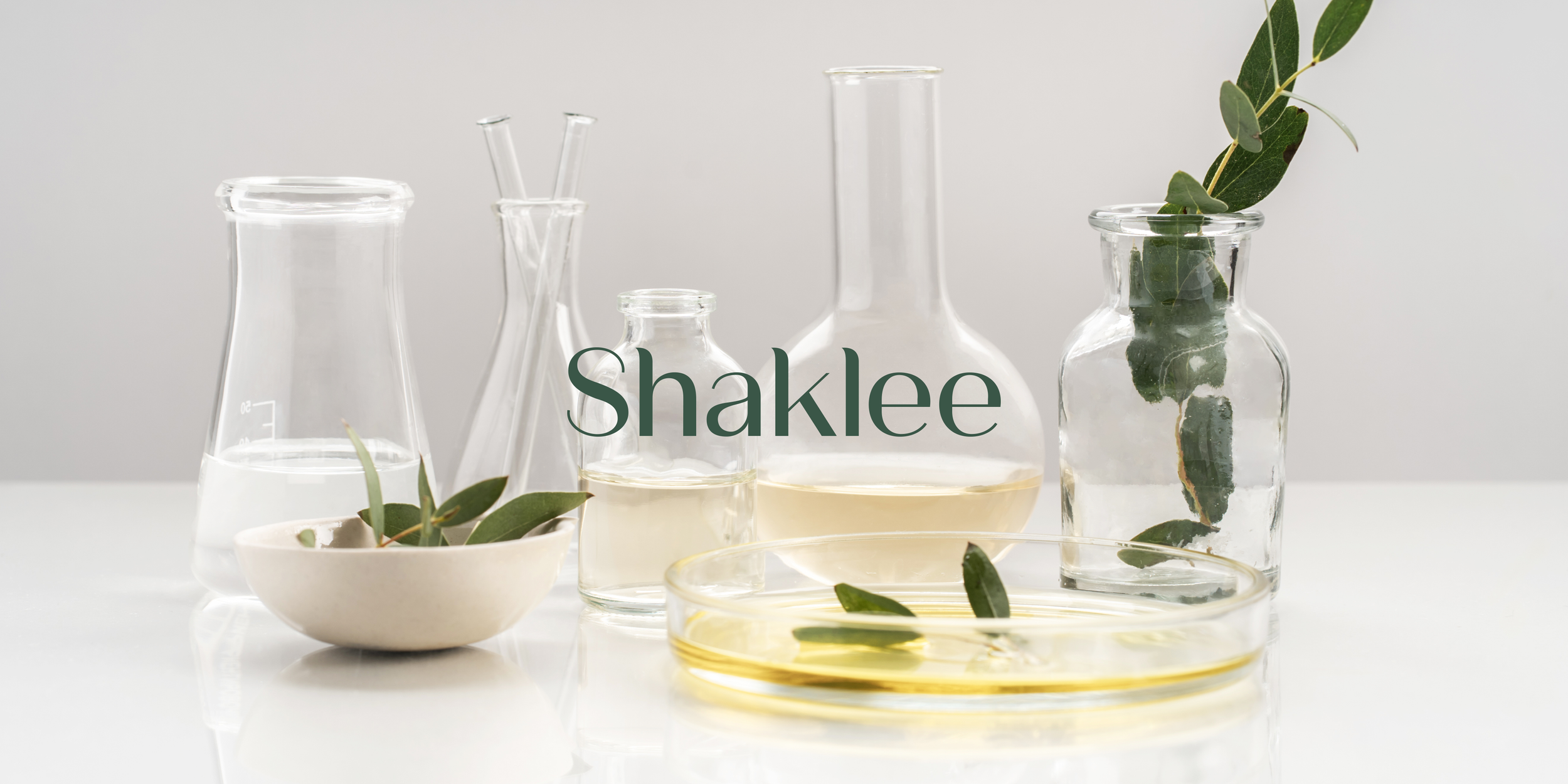
Elegance and expertise
The ultimate brand direction celebrates the quality product ingredients, emphasizes the science behind product creation and exudes an approachable and soothing calm. High detail ingredient photography explores beauty; zooming into and examining the science behind the Shaklee product. Beakers become vases and plant cells become intricate lace patterns. Deep lush colors and a pacifying green keep the communications natural and grounded.